Meet the New ZOLL Dispatch and ZOLL Respond CAD Solution
10 Things EMS Software Could Learn From Apple
Each year, I try to attend the Apple World Wide Developer Conference

Each year, I try to attend the Apple World Wide Developer Conference. So why would an EMS physician jump into the middle of 5,000 software developers for an entire week of classes related to software design and programming? After spending over 10 years working to design and implement National EMS Information System, NEMSIS within local and state EMS systems, I was hoping to learn from the masters. No one disputes Apple’s ability to create user experiences that are simple and easy to use. The same cannot be said for all EMS software. Ultimately, software and how it is developed on Apple’s platforms (iOS for iPhone and iPad, OSX for the Mac) drives the industry so we all pay attention. Here are 10 things EMS software should learn from Apple:
1. Simplify the Complex
-
Software should improve a users ability to complete complicated tasks rather than making them... well, more complicated.
-
User interfaces should be carefully thought out and designed to improve the users experience while assuring accurate and complete information capture.
2. Users Don’t Use Software, they Interact With it
-
Software is more than just a screen for data entry or report generation. Software should interact with the user to improve usability, accuracy, timeliness, and quality.
3. Don’t Let the Application Get in the Way
-
The user should be able to use the software and navigate the user interface without thinking. It should be natural and intuitive. This does not come by accident and is the result of a well thought out design and implementation.
4. Decrease Clutter
-
Lets face it, EMS software (or for that matter all patient care documentation software) is complex requiring multiple screens to navigate and document a patient care report. The user interface should simple, clean, and easy to navigate but still provide quick access to any area of the application with a minimum of clicks or taps.
5. GIS Mapping
-
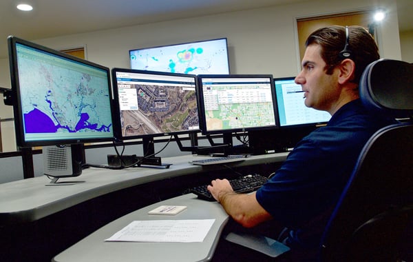
One of the best new tools technology has brought to users in the past 5 years is Geographic Information Systems (GIS) that allow location based analysis and mapping.
-
The ability to either document a location using GPS coordinates or document a physical address using a reverse GIS lookup should be standard within EMS applications.
6. Don’t Ask for Information You Can Get Elsewhere
-
Users should not have to document information that already exists. Data that can be obtained electronically from another device or data system should be imported into the software.
7. Devices Are a Part of the Software (Form is Function)
-
Good software uses tools (GPS, camera, etc.) to drive the user interface, complete the software’s tasks, and improve the user experience.
-
If tools are integrated correctly into the software, users should not be required to configure them nor even know of their existence.
8. Users Should Not Worry About Files
-
The user should not be expected to understand file formats, file systems, or file locations.
-
Software should present a user interface where the format, security, and location of its files are managed transparently to the user.
-
Users should interact with the software to search and find files as needed without navigating or necessarily understanding where they a physically located.
9. The User Interface is Driven by the Story
-
Good user interfaces are based on natural intuitive events.
-
The use of storyboards is helpful to flesh out how the application will look as well as obtain feedback from prospective users prior to programming and development.
-
Software as much as possible should mimic, reproduce, or complement the normal workflow of the user
-
Even large complex applications used by EMS, must provide quick access to the most important tasks of the user
10. Make a Difference. This is What Matters
-
Software and devices are more than a tool we use to accomplish a task. It is the experience and how it makes the user feel that matters. For EMS it is also the impact it makes on the patient and their care. In Apple’s words: “We spend a lot of time on a few great things. Until every idea we touch enhances each life it touches.
EMS software is migrating to the NEMSIS Version 3 standard. This new standard builds on the existing NEMSIS Version 2 software but incorporates several new components to improve the user experience while assuring complete and valid data entry.
When an EMS professional can interact with the software, allowing it to complete the majority of the documentation for them, providing appropriate feedback when needed to assure a quality result, we can spend more time where it should be focused, on the patient.
Related Posts
Collect More Revenue Faster: The Pivotal Role of Clear, Concise, and Complete Documentation
ZOLL Pulse Blog
Subscribe to our blog and receive quality content that makes your job as an EMS & fire, hospital, or AR professional easier.
ZOLL Pulse Blog
Subscribe to our blog and receive quality content that makes your job as an EMS, fire, hospital, or AR professional easier.


